Smart Photo Gathering (ML)
Smart Photo Gathering (ML)
Smart Photo Gathering (ML)
Smart Photo Gathering (ML)
Smart Photo Gathering (ML)
Smart Photo Gathering (ML)
UX Strategy + UX Design + Visual Design + Stakeholder Reviews
Leadership ・ User Experience ・ Product Design
Personalized Storybooks
UX Strategy + Roadmap Planning + UX/Interaction Design + Visual Design + Stakeholder Reviews


Goals
Shutterfly launched a new Kids category which includes products like school items, puzzles, home decor, and more. One of the more anticipated new items to be pushed for the holiday season was Personalized Storybooks which can be customized with names and personalized characters.
-
Launch 12 titles by Q4 (11 licensed, 1 original)
-
Generate target of $3 million in Q4 (projected $10mill in the following year)
-
Raise awareness to new Kids category
-
An experience where customers can complete a personalized storybook in under 5 minutes
-
Simultaneously launch on both mobile and desktop
DISCOVERY
Research
As a new product on Shutterfly, we were not able to lean into data analytics, so we relied heavily on comparing competitive offerings.
We held an internal test where we would walk through each experience and order products from competitors (individually and again as a group – including design, product, engineering, QA, and select invitees throughout the company). We also ran user tests to determine common reactions and issues. We shared our discoveries and came up with a defined list of takeaways that we wanted to keep in mind moving forward.
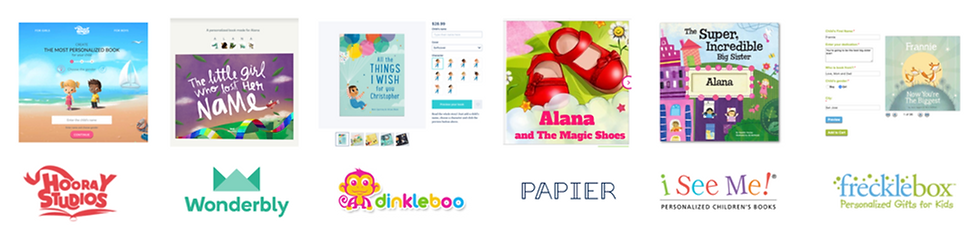
KEY TAKEAWAYS:
-
Hooray Heroes and Wonderbly have good experience, especially on mobile web
-
Most are extremely simple to create and can be completed within a few minutes
-
None offered licensed content
-
Best experiences were those with finer customization (hair, skin, eye color, etc.)
-
All priced comparably
Challenges
-
An experience that can fit within one of our existing engines
(avoid creating new metaphors that are unique to single product)
-
Properly organize content back-end to present best personalization experience
-
Certain titles are more complex and present personalized content in unique ways
(individual pages based of the letters of someone's name)
-
Offer new, unprecedented personalization options on our product information page
IDEATION
Brainstorm
As a team, we brainstormed on how to best approach the shopping and creation experience, keeping in mind our discoveries, existing metaphors, and sound design. We began by making rough mockups and wireframes based on our current store framework.

Exploration: Shopping and Category pages


Exploration: Product Information page
Competitors utilized customization options that we did not currently use at Shutterfly, so part of the challenge was trying to fold these new options into one of our creation engines in a way that made sense and felt seamless.


Exploration: New customization options for Product Creation

Wireframes + Stakeholder Review
My team came up with three (3) possible solutions which we presented internally as well to small focus groups of users (both existing and new).
OPTION 1 - Floating Widgets

PROS
-
Clarity on what is being personalized
-
Large view of product (book)
CONS
-
Repetitive personalization options
-
New metaphor that would require extensive engineering work
-
Not mobile-friendly
OPTION 2 - Top Navigation
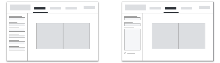
PROS
-
More linear than floating widgets
-
Large view of product (book)
-
Non-repetitive
-
Tabs can be translated to mobile
CONS
-
Options heavily obscure product
-
New metaphor that would require extensive engineering work
-
"Optional" tabs feel too equally weighted. Users may feel too obligated to complete optional customization.
OPTION 3 - Side Palette

PROS
-
Puts emphasis on required personalization (on first tab)
-
Feels lighter and quicker
-
Non-repetitive
-
Folds easily into existing creation engine
CONS
-
Smaller product representation
WINNER: OPTION 3 - Side Palette
-
Closest fit to most competitive offerings.
-
Experience can leverage existing metaphors.
-
Existing customers found it to be easy and intuitive
-
Least amount of LOE (level of effort) for all teams

DESIGN
Interaction
With ideas approved and sign-off, we began creating high-fidelity mockups for engineers to start building from.
Another challenge we faced was the Content Team's confidence in building out a DAM (digital asset management) system that could support compounding multiple attributes to create a single character preview (i.e. choose multiple attributes – eye color, hair, and skin tone and dynamically render a single preview of the resulted character on the fly).

DAM system organization
An alternative proposal was to flatten out the character options. This would result in showing all possible combinations of any given character. This was NOT ideal since the number of choices could overwhelm users, forcing them to hunt and peck through a seemingly endless amount of choices. We could curate and pare down the number of choices, but, not only would it create more manual (non-scaleable) work for our teams, many users may not able to find a fitting choice, leaving them frustrated and prone to dropping off.

Exploration: Alternate version with flattened character choices.
Busy, overwhelming, and requires dedicated tab for each character.
I pushed back for the sake of good user experience, referring to user tests which clearly demonstrated that the success of this product heavily relied on easy, flexible, and robust customization. The content team was asked to spike on building a proper DAM system, and with the help of additional team members being added to their budget, they were able to deliver within a few weeks.

Flattened character selection
VS
_characters_default.png)
Robust compound customization
The result was an uncluttered system that was simple to use and allowed users to quickly create intended characters with confidence. It also eliminated the need to individually label flattened choices, helping the results feel more personal.
High-Fidelity Mockups
Default View
-
Customers will be able to check out as long as these choices and fields are completed
-
All required choices are presented on the default state (contained within the first tab)
_characters_default.png)
Dynamic Updates
-
Book is updated dynamically as you enter names and make character choices
_characters_inner_p.png)
_characters_inner_p.png)
Story Extras
(optional)
-
No penalty for not completing optional information
-
Book content is still high-quality without it
-
Completing it can add deeper personalization
_extras.png)
Dedication Page
(optional)
-
Also no penalty for not completing dedication page.
-
Ability to add personalized text and a photo
-
Design changes based on what information is filled out. Content team determines layouts for each case.
_dedication_filled_.png)
Mobile Translation
-
Simplified to accomodate mobile devices
-
Uses translation similar to other products like cards and gifts
-
User-testing results find that it remains intuitive and easy to use

VALIDATION
User Testing
My team created interactive prototypes (inVision and Principle) for both desktop and mobile platforms and ran it through user-testing. The flow was pretty simple and straight forward, but we rely on these tests to validate the direction we chose and to find any hangups or discrepancies within the design.
Main Takeaways:
-
Testing showed excitement for product
-
Flow was very straight forward on both platforms
-
Most users navigated through all tabs
-
Many did not feel obligated to complete optional items but wanted to see what they were
-
Usage of photos (dedication page) was low, especially on desktop (as expected)
-
Vast majority completed the flow to checkout under 10 minutes
Iteration
-
Not much iteration was required, but we did clean up some of the icons and error states for the sake of clarity.
IMPLEMENTATION
Design Specs
With the design validated, we are able to finalize specs and have them delivered to our development team (via Zeplin). Each screen is made pixel-perfect along with notes for engineers to keep in mind. Most specs are accompanied by a deck containing more detailed nuances that cannot be conveyed within a Zeplin project. Assets could be pulled directly from within Zeplin. More complex interactions and/or animations require additional prototypes and/or video samples (noted and linked to from within the deck). Any updates were sent out along with a list of changes and the reasoning behind the decision.

Quality Assurance
-
When enough progress is made, our QA team uses the specs and our guidance to walkthrough the beta and search for any bugs or discrepancies. As the thinkers and designers behind the product's interaction and flow, it is our job to personally go through the project. No one will grasp the fine interactions and flows as well as the designer will. The teams meet regularly to ensure proper implementation and to clarify any ambiguity.
Company Test Fest
-
Once enough progress was made, we sent invites to fellow employees to test drive the new feature (as we often do for brand new features) accompanied with a database link where they can leave feedback and note bugs they may find.
A/B Testing
-
For our Personalized Storybooks. much of the A/B testing took place on the marketing side, but one thing we did test for was a popup that encouraged customers to view the dedication tab if they had not already done so. We saw no significant lift in conversion, so we decided to omit it to keep friction low.
RESULTS
-
Soft-launched 6 titles in Q3, and successfully launched all 12 titles by the start of Q4
-
30 titles currently available, some licensed with Nickelodeon and Sesame Street
-
Revenue goals surpassed
-
Average time spent creating was just under 10 minutes, but about 35% spent under 5 minutes
-
Successfully launched on both mobile and desktop by the holidays
EXTRA CREDIT
The team was on a tight deadline, and we found support to be short on both the commerce and content teams. I took time to fill in for those roles and created extra designs for our thumbnail and product information pages. I also helped content create and organize assets used within the store.
PIP Design
_pip.png)
Thumbnail Page Design

Created Thumbnail Content for Store
